
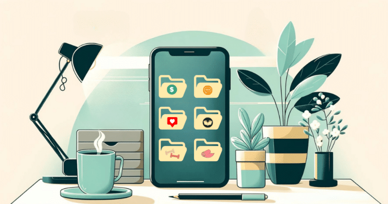
It is easy to create a phone theme that looks exciting for ten minutes. It is harder to create one that still feels useful after a week of appointments, low battery warnings, rushed messages, and dozens of unlocks. The difference is rarely a matter of taste. It comes from whether the theme supports real use. A lasting theme makes key actions easier to find, keeps text readable, and leaves enough visual quiet that the screen does not become tiring.
Instead of choosing a theme from a single preview image, evaluate it as a small interface. A useful checklist asks what will be seen most often, what will need to be tapped quickly, and what will create friction in bad lighting or a busy moment. This approach does not make personalization less fun. It makes the result more personal because it is designed around a person’s habits rather than a short-lived trend.
Check the Screen at a Glance Distance
The first test is visibility. Hold the phone at a normal distance and ask whether the clock, notification badges, and app labels can be understood without effort. Themes with pale text over pale photographs or thin icons over detailed backgrounds may look polished in a static mockup but become difficult to use outdoors. Contrast is not only a design rule; it is the difference between finding a map quickly and searching around for it.
Try the screen in more than one condition. Look at it near a window, in a dim room, and after the brightness has been lowered. A theme that works only at full brightness is not finished. This is especially important for widgets. Their text is usually smaller than an app icon label, so a busy background can make useful information vanish. Choose a wallpaper with calmer areas behind the most important text, or use widget styles that create their own readable surface.
Color should create hierarchy, not confusion. If every icon uses a different saturated color and every widget has a different border, the eye has no obvious place to begin. Pick one or two accent colors and let neutrals do the remaining work. A bright color can mark the apps that demand action, while softer colors keep secondary tools available without competing for attention.
Choose a Theme for Your Routine, Not an Imaginary One
A good theme reflects the way the phone is actually used. Someone who opens transit directions at the same time every morning may want maps in the dock. Someone who tracks freelance work may need a calendar widget before a social feed. Someone who uses a phone mainly for photos and music may prefer a simpler information layer and quicker media access. The best arrangement is not the one with the most features; it is the one that removes steps from repeated actions.
Write down the first five apps opened on an average day. These apps deserve direct access. Next, identify the tools that are important but occasional, such as banking, travel, account management, or home controls. Put those into clear folders or a second screen. This creates a useful distinction between everyday movement and backup resources. A theme becomes easier to maintain when it does not pretend that all apps are equally urgent.
It also helps to consider one-handed use. The lower portion of the screen is easier to reach on many devices, so it is a natural home for camera, messages, maps, or a browser. A visual design can be beautiful and still be impractical if frequently used icons sit where a thumb cannot comfortably reach them. Practical placement is part of the theme, not a compromise made after the aesthetic choices are complete.
Make Widgets Useful Enough to Keep
Widgets can give a theme its character, but they should not become filler. Each one should answer a question: What is next? Do I need an umbrella? Which task is due? What is playing? When a widget has no clear answer, it is probably taking space from something more useful. Start with one larger widget that supports a daily decision and one smaller widget that gives quick context. Add more only after living with the layout.
Temporary widgets are often better than permanent ones. A travel countdown, event ticket, delivery tracker, or seasonal photo can be enjoyable for a short period and then removed. Treating these as temporary keeps the first screen from accumulating stale information. The home screen should change with the calendar without becoming a scrapbook of last month’s priorities.
When testing combinations, it can be helpful to explore iScreen for widget and wallpaper options that can be adjusted as a group. The important part is not collecting every available style. It is trying a combination long enough to learn whether the widget is read, whether its typography is clear, and whether it supports the actions that happen before the phone pulls attention elsewhere.
Keep the Icon System Simple
A long-lasting theme normally has a clear icon rule. It might use rounded shapes, a limited color palette, a hand-drawn appearance, or a clean monochrome approach. The rule should be easy to describe because it will guide later additions. If a newly installed app cannot fit the visual language, decide whether it belongs on the first screen before forcing a custom icon into the layout.
Do not confuse uniformity with usefulness. Original app icons can remain where recognition matters. The objective is to prevent a collection of unrelated visual styles from making the screen feel accidental. A person may keep familiar icons for payments, camera, and communication while using themed icons for less recognizable utilities. This balance preserves speed while still creating a coherent look.
Spacing is another part of the system. An empty row, a gap between groups, or a deliberately smaller cluster can make a screen easier to scan. Filling every slot often creates the feeling of unfinished work, as though every new app must be accommodated immediately. A little unused space gives priority apps room to stand out and makes the whole layout feel deliberate.
Plan for the Theme to Change
The strongest themes are not frozen. They have a stable foundation and enough flexibility to adapt. Keep the core dock, the main information widget, and the first-page categories consistent. Then allow the wallpaper, secondary widget, or entertainment page to change with mood and season. This makes the phone feel refreshed without forcing a person to relearn where everything is.
Set a small review point after seven days. Did any icon remain unused? Did a widget become visual noise? Did a folder turn into a hiding place for unrelated apps? Answering these questions makes refinement easy. Most failed themes do not fail because the original concept was bad; they fail because no one removes the small annoyances that appear during normal use.
A phone theme is worth keeping when it survives real life. It stays legible on a hurried morning, supports the apps that matter, and feels pleasant without asking to be admired every time the screen turns on. That is a more durable standard than novelty, and it is the one that makes customization genuinely useful. It should also remain clear after notifications arrive, brightness changes, and temporary apps begin competing for space during an unusually busy week.
Use a Seven-Day Test Before Calling the Theme Finished
A theme earns a permanent place only after it has survived normal use. For seven days, do not evaluate it only when there is time to admire it. Notice it while checking a message in a queue, finding a route outdoors, changing music, or looking for a task between other obligations. Those brief encounters reveal whether the theme is supporting attention or asking for too much of it.
Keep a short mental list of friction points. Perhaps the most-used app is now difficult to distinguish, a widget takes too much room, or the wallpaper makes labels disappear in sunlight. Do not discard the entire theme immediately. Adjust the specific element responsible. Change a crop, restore one original icon, shrink a widget, or move an app to the dock. Durable themes are usually refined through these small corrections.
Pay attention to the relationship between the theme and notification behavior. A well-designed grid can still feel agitated if every app displays a badge. Decide which alerts deserve visible urgency and remove the rest. This is especially effective with strong colors, because the eye will always be drawn to a red count before it notices a carefully selected wallpaper or icon style.
At the end of the test, ask whether the phone feels easier to use than before. If the answer is yes, the theme has done more than refresh the appearance. It has created a better working surface. If the answer is no, keep the parts that helped and let the others go. The right theme is not the one that receives the most compliments; it is the one a person does not feel compelled to replace next week.
